Splash of FUN
July 2, 2010Happy, happy Home Tour Friday! As you prepare for this excellent 4th of July festivities, I appreciate you taking a second to drop by!
Today we’re headed to Corona del Mar, California to see a 1940’s bungalow exploding with color.
Strap on your seatbelts because here we go…
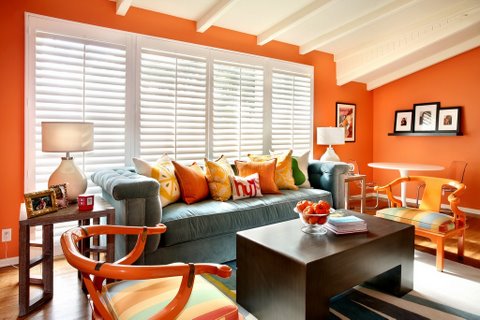
Family room.
Doesn’t this just scream California sunshine?
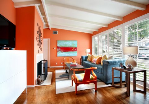
I just love the happiness and cheer embodied here.
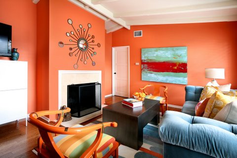
Although separate, the living/dining, and family/den rooms are all visible from each other, so the same colors (turquoise, aqua, yellow, green, fuchsia, among others) are interspersed throughout to create a flow.
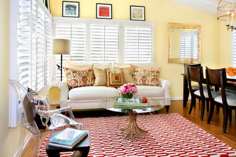
The traditionalist in me loves the look of this room, especially the white bermuda shutters which make everything look clean and fresh.
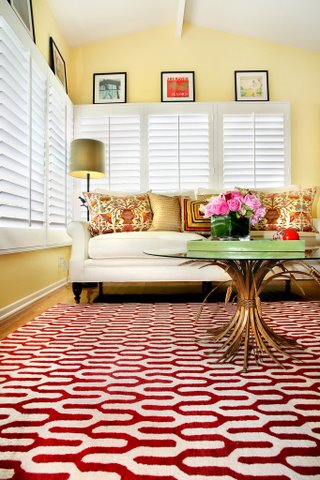
Love, love, love the pattern and the color of this rug.
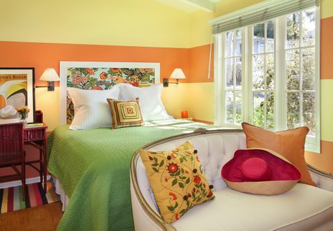
The master bedroom, originally painted in the same ‘lemon drop’ color as in the living/dining room. However, this one shade didn’t work, and actually made the room feel smaller than it is. Natalie, the designer, used a trick-of-the-eye painting technique to make the room feel larger – she added 27″ wide horizontal ‘flower pot’ color stripes around the entire room – which guides the eye downward and makes the space feel much more comfortable.
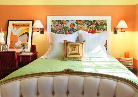
I LOVE this headboard and I think I could make it too.
Isn’t this a fun home? I love the casual elegance as well as the California cheer this home exudes.
WHOOAA!!! Stop the presses – I was just checking out the designer, Natalie Umbert’s website and she has painted her walls yet again:
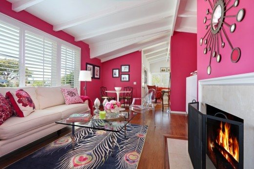
The Running Man could never live here, but I LOVE it – the walls, the rug(!), the pillows, the light.
Scroll back and see the orange versus the pink and let me know which you prefer.
Special thanks to Natalie Umbert of Atelier Interior Design for this incredibly fun home tour.
Many thanks to Jeri Koegel for use of her photos.
Everyone, have an incredible Fourth of July Weekend! Let me know when you get a chance what you did. I just love this holiday!
Share this post
You might like...
Category: Home Tours
Tags: Corona del Mar, Home tour Friday, Natalie Umbert |





 Home Styles Defined, Part 1...
 The Round Houses of Des Moines
 The Most Ingenious House Ever...
 Dennis Quaid's Ranch in Montana...


Sarah
on July 2, 2010 2:31 pmI prefer the orange, but I love orange! My old kitchen was orange, the color of pumpkin pie. I loved it in the fall especially.
I like those blinds too, very California!
RLR
on July 2, 2010 5:52 pmI’m not really an ‘orange’ person, but I have to admit that I like it better than the pink. The pink is lovely, but I am not sure that I could relax in a den that is so… well, pink. Gorgeous house!
Marla
on July 2, 2010 7:33 pmI think I’m more of a yellow person, but I do love color!
Chani M
on July 5, 2010 9:23 pmDefinitely digging the orange over the pink! Great colors though!!
Katie Fisher
on July 7, 2010 2:33 pmlove the orange – maybe i will do my sunroom that color.
me
on October 10, 2010 2:49 pmVery colourful & flamboyant!